
Send the same feature list to three developers and you will get three different prices. That is not because two of them are wrong. A list that says "homepage, booking calendar, customer login, dashboard" names screens. It says nothing about what the business needs to happen, so each developer fills the gaps with their own assumptions.
A written scope closes those gaps. A first draft can fit in an afternoon, it costs nothing, and it is the single most useful thing you can hand over before asking for a quote. The steps below work for a marketing website, an online store or a web application.
Start with the job, not the features
Write one plain sentence about the outcome. For a marketing website it might be: a visitor understands what we do and sends us an enquiry we can act on. For an internal tool: a coordinator assigns each new request without copying it between three apps.
Then make it testable. Who does the task? What do they need before they start? What does a successful finish look like? A sentence you cannot test is a slogan, and a slogan will not stop an argument about scope later.
A hypothetical example. Imagine a bakery in Lahore that takes custom cake orders over phone calls and WhatsApp. Details get lost, and nobody can see which orders are confirmed. Its sentence could be: a customer places a cake order with every detail we need, and the kitchen sees it the same day. That one line already rules out a lot of nice-to-have pages.
Sometimes a single hard requirement shapes everything else. The offline document management system WISVERA built for a university administration office began with one: the records had to stay on the office's own computer. That is why it is a Windows desktop application with a local database rather than a hosted web app. You can read how it turned out on the project page.
Website, web app or mobile app: pick the right shape
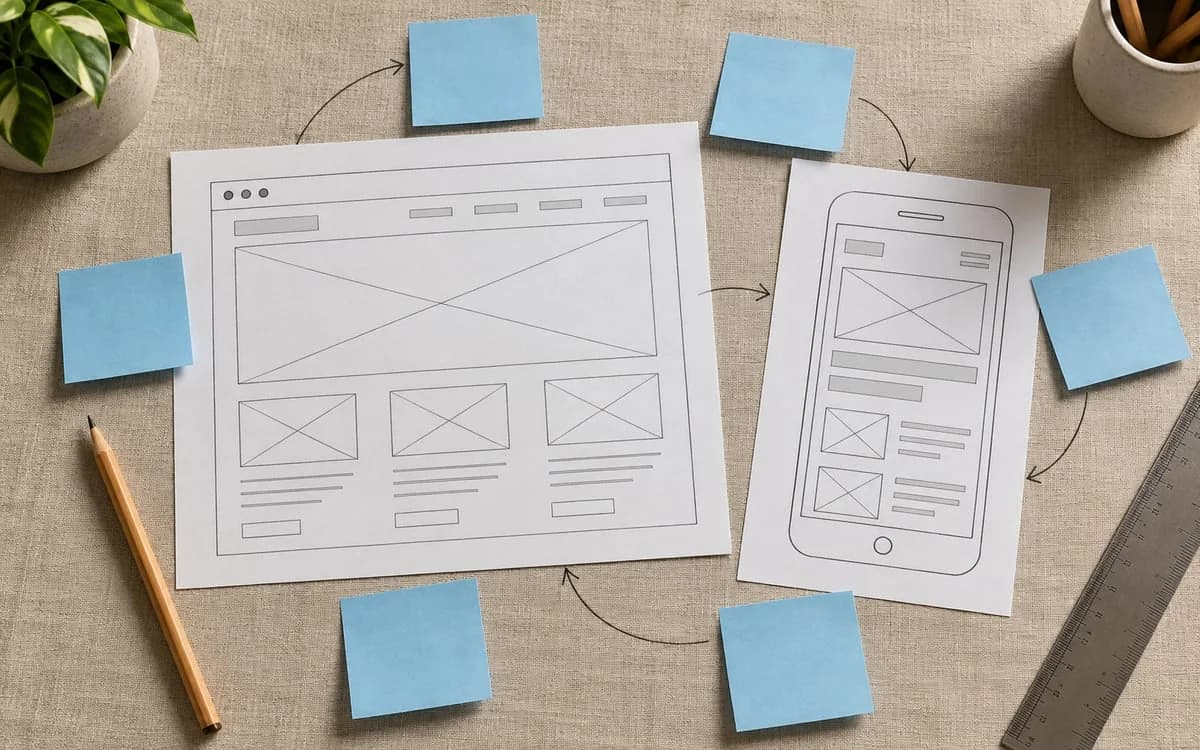
People often ask for an app when they need a website, and for a website when they need an application. This table is a rough guide, not a rule.
| Website | Web application | Mobile app | |
|---|---|---|---|
| What people mostly do | Read, compare, send an enquiry | Sign in, enter or manage records, repeat a task | Use device features, work offline, get notifications |
| Typical signs you need it | Visitors arrive from search or social links | Staff or customers need accounts and saved data | A browser cannot do the job well enough |
| Cost drivers | Page types, content, design | Accounts, permissions, integrations, reports | Everything in a web app, plus store review and two platforms |
| Easy to get wrong when | Content is not ready | Nobody has listed the records and rules | The same task works fine in a browser |
If you are not sure, assume the cheaper shape and write down what would make you change your mind. A website that takes enquiries can grow into an application later. Rebuilding an app you did not need is slower than starting small.
Pick one first audience and walk their journey
List everyone who will touch the product, including the staff who maintain it. Then choose the one audience whose task matters most for the first release. Serving every visitor at once is how navigation gets crowded and priorities go vague.
Describe that person by their situation, not their demographics. What question brings them here? Which device are they holding, and on what kind of connection? If most of your customers reach you from a phone, design and test for a phone first.
Now sketch the journey as a sequence of decisions. For the bakery:
- The customer opens the order page from an Instagram link.
- They choose a cake, a size and a date.
- They add a message and a reference photo.
- They confirm and get a clear answer about what happens next.
Then add the awkward moments: a date that is fully booked, a photo that is too large to upload, a payment that does not go through. Mock-ups rarely show these, and they are where most of the real requirements hide.
List the content and the data, and who owns each piece
For every step in the journey, note the information people need in order to decide. On a website that usually means service descriptions, photos, prices or price ranges, FAQs and contact details. Mark what exists already, who owns it and whether it is ready to publish. A finished design can sit unpublished for weeks waiting for copy and photos, so give content its own line in the plan. If you need pages in English and Urdu, say so now. It changes the layout, the writing work and the testing.
For an application, list the records the system keeps and how they relate. In the bakery example, an order belongs to a customer, has a pickup date and a status, and may have a photo attached. Note which fields are required and who may see or change them. This short inventory is what separates a page that displays information from a system that has to keep it correct.
Decide what the first release leaves out
Go through every proposed feature and ask: can the customer finish the main task without it? If yes, move it to a "later" list with one sentence on why it might matter. You keep the good idea and the first release stays small.
Write the boundaries as clearly as the inclusions:
- The first version takes orders. Payment is collected on pickup.
- Staff update the menu. Customers do not create accounts.
- English only at launch. Urdu pages follow once the order flow is stable.
There is a limit to this trick. Do not cut security, accessibility, backups or the ability to correct a wrong record in the name of keeping the release small. Those are not features. When someone asks for a new feature mid-project, compare it with this list and choose deliberately whether to change the scope, the schedule or the budget. A boundary you wrote down is easy to discuss. One you assumed turns into a dispute.
Write acceptance criteria you can test
"The form should work" is not a criterion. These are:
- Required fields explain what is wrong in plain words.
- A valid order reaches the kitchen's agreed channel within a minute.
- Pressing submit twice does not create two orders.
- The customer sees a confirmation that says what happens next.
- The whole order can be placed on a small phone screen and with a keyboard alone.
The last one is worth borrowing from a standard instead of inventing it. WCAG 2.2 success criterion 2.1.1 says all functionality must be operable through a keyboard, and you can paste the criteria you care about straight into your brief. The same goes for speed. Google's Core Web Vitals define "good" as a Largest Contentful Paint of 2.5 seconds or less, an Interaction to Next Paint of 200 milliseconds or less and a Cumulative Layout Shift of 0.1 or less, measured at the 75th percentile of real visits. Telling a developer "meet the good thresholds on mobile" is clearer than "make it fast".
Add the quiet requirements as well: who can update content after launch, what documentation they get, where the site is hosted and who pays for it.
Mistakes that make quotes useless
- Describing a look instead of a job. "Modern and clean, like our competitor's site" gives a designer a mood and a developer nothing.
- Leaving content for later. Late copy can hold a launch up for weeks, and it is outside the developer's control.
- No single decision-maker. If three people can each ask for changes, the scope has three owners and no owner.
- Asking for a fixed price on unknowns. If you cannot say what the system must do, any fixed number is a guess. Either side then pays for the guess.
- Forgetting life after launch. Hosting, updates, backups and fixes need an owner and a budget. Our CARE service exists because this step is so often skipped.
When you should not write a full scope yet
If you cannot state the job in one sentence, a long document will only record your uncertainty in more detail. Do something smaller first: a clickable prototype of the riskiest step, five conversations with the people who would use it, or a short consultation about direction. WISVERA's ADVISORY service is built for the case where the problem is clear but the approach is not.
Turn it into a one-page brief
Your brief can fit on a page:
- The job, in one sentence
- The first audience and their journey, including what goes wrong
- The content and data list, with owners
- What is in the first release and what is not
- Acceptance criteria
- Constraints: an existing domain, a tool you must keep, who approves decisions, a date that cannot move
Separate what you know from what still needs checking. Only then compare technical approaches, because the right choice depends on the job, who will maintain it and which systems it has to connect to.
If you are planning a website, store or web app, the BUILD service page shows what that work covers. If the project also involves orders or follow-ups that should happen automatically, map the workflow first. And if you want a second pair of eyes on your brief, send it to us at contact@wisvera.com. We would rather tell you honestly that the scope needs another pass than quote on a guess.
Written by WISVERA, a founder-led studio. We use AI tools when drafting and check each guide against the sources it links to before publishing. Found a mistake or have a question? Email contact@wisvera.com.